The Design Layer
AI has no taste — bring yours
Progress saved locally. Sign in to save it permanently.
AI Has No Taste
This is the sentence that separates vibe-coders who ship forgettable products from those who ship products people remember. AI will generate code that works. It will not generate code that feels right. That is your job.
Taste is not subjective fluff. It is a technical skill. It is the ability to choose the right font pairing, the right spacing rhythm, the right color temperature. It is knowing when a page feels cluttered and when it feels considered. AI cannot do this. It can only follow instructions.
The Design System Comes First
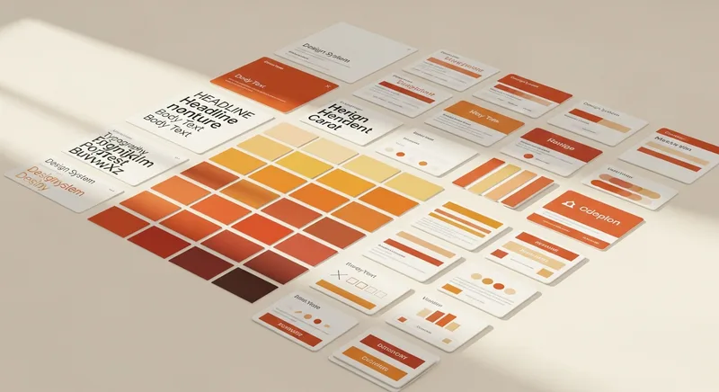
Before you write a single queue item that builds UI, you need a design system. This is not optional. Without it, every component the AI builds will use different spacing, different font sizes, different interpretations of "clean" and "modern."
What a Design System Contains
- Color palette: Background, text, accent, muted, borders. Not 47 colors. Five to seven, max.
- Typography: One heading font, one body font. Sizes for H1 through H4, body, small text.
- Spacing: A consistent scale. 8px, 16px, 24px, 32px, 48px, 64px, 96px.
- Border radius: One small, one large. Not a different radius on every element.
- Shadows: One subtle, one prominent. That is it.
- Tone of voice: "Confident but not arrogant. Technical but not academic."
Font Pairing
The fastest way to make an AI-generated site look professional is font pairing. One serif heading font paired with a sans-serif body font. Some combinations that work:
- Fraunces + Inter — Editorial, warm, confident. What this site uses.
- Playfair Display + Source Sans Pro — Classic, elegant, slightly traditional.
- DM Serif Display + DM Sans — Modern editorial, balanced weight.
Color Temperature
Most AI-generated sites default to pure white backgrounds (#FFFFFF) and pure black text (#000000). This is technically correct and emotionally cold. Warm your palette slightly:
- Background: #FAFAF8 instead of #FFFFFF
- Text: #1A1A1A instead of #000000
- Muted text: #6B6560 instead of #666666
These tiny shifts make the entire experience feel warmer and more human without being noticeable on their own.
The Reference Site Technique
Find 2-3 sites whose design you admire. Include them in your spec as references. Tell the AI: "The visual tone should feel like Stripe's documentation crossed with a Smashing Magazine article." This gives the AI a concrete reference instead of vague adjectives.
Never Dark Outside Code Blocks
Unless you are building a tool specifically designed for dark mode (like a code editor), keep the body of your pages light. Dark backgrounds in content areas reduce readability, increase bounce rates, and make editorial content feel like a dashboard. Save dark backgrounds for code blocks and the footer.
My Notes
Community Contributions
Sign in to see and vote on community contributions.
Have something to add to this module?
Sign in to Contribute